Part 03 In-Betweening
(Click images to see a full version illustrations)
Wednesday, February 16, 2011
Tuesday, February 15, 2011
Thursday, February 10, 2011
Interactive Loading_Rajendra Gurung (ID:0205271), CQU Melbourne
Design Rationale:
According to the project we are asked to create an interactive loading that shows the transformation on the object and a dynamical changeable animation while loading.
My Ineteractive loading is the life cycle of Frog. As the life cycle of the frog starts from eggs and after many stages then become a final frog. From all the process of development i have choose main six stages to represent loading percentage showing 0%,20%, 40%, 60%, 80% and 100% respectively.
Software i used is Adobe Illustrator CS4.
Metaphorical Navigation Design_Rajendra Gurung (ID:0205271), CQU Melbourne
Design Rationale:
As we are given to create a metaphorical navigation design that the navigation interface design should describe three functional characteristics of as object. My object is a chess board. As everybody is familiar with chess and almost all of them know how to play and how it works.
My design interface is a whole chess board. As you see there are some chess objects and some text. But when you try to click on the text there is no any effect. But as to move your curser to the over the objects it will make some changes as shown in the designs, just like the functional characteristics of the real chess game.
I used only Adobe Illustrator CS4 to create this whole design.
Wallpaper_Rajendra Gurung (ID:0205271), CQU Melbourne
Design Rationale:
“If you can dream it, you can do it. Always remember that this whole thing started with dream and a mouse” Walta Alias ‘walt’ Disney(1901-1966).
This is one of the all time favourite quote of mine. As this quote itself describe everything it’s no need to tell any further description. If you look at the wall paper every one can tell that the mouse is the dreamer. All i want to present is that dreams can be anything and dreamers could be any one. I think dreams are always beautiful, colourful and full of happiness. So my wallpaper design is full of colours and happy theme and so I have chooses some pictures from Walt Disney creations and their characters to create my design. I have used Photoshop to create my design.
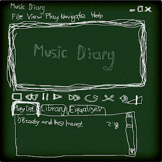
Skin Design for Media Player_Rajendra Gurung (ID:0205271), CQU Melbourne
Design Rationale:
My theme of the media player is “Diary of Music”. Just like real diaries I tried to design my media player by hand drawn from pencil too. The software I used is Adobe Photoshop CS4.
As i was looking on www.winamp.com for some inspiration. I have seen lots of examples in skin categories. And I think of doing something new and creative ideas. So I think of the materials and the objects I could link with media player then I had an idea. Why not media can be link on the book ? Just like we open the book and search for what we want we can also made a media player interface just like a book so we can search for the library and Medias too.
And finally I decided to make a “Music Diary” Diary of music. And to make more like a diary i tried to create the interface by drawing with pencil tool so I will give more feel of a diary.
Thursday, February 3, 2011
Board Skin Design_Shaohua Han (ID:s0206762), CQU Melbourne
Rationale
Project: Board skin design
For this time my project is about design board skin which is use for the forum, before I start to do this project I did a lot of research about forum, then I think about the layout of the forum and most of forums’ layout are simple and clear. After that the information is very important part for forum as well so I must make the board skin easy to read.
When I finished my research I start to try to design the layout of my board skin. At first, I draw the layout on the paper then Illustrator to do this project. I just use two colors for my project because if I make the layout too fancy I think the cline that want to read the information will lose their focus. For the colors I chose blue and orange. Orange is a very and energetic color and blue is used extensively to represent calmness and responsibility, light blues can be refreshing and friendly that is why I chose these two colors.
From this project I knew how to make my design looks clear and how to understand what is clines want to get what are they focus, if I knew that I think I can design a suitable design for my customer.
Subscribe to:
Posts (Atom)


